
For Annex I created a set of punchy social assets built from simple geometric shapes, bold colour and playful motion.
The goal was to make scroll-stopping visuals that were easy to recognise as Annex at a glance. I designed and animated short loops (like the one above) that felt clean, energetic and brand-friendly, ready to drop straight into their social channels.


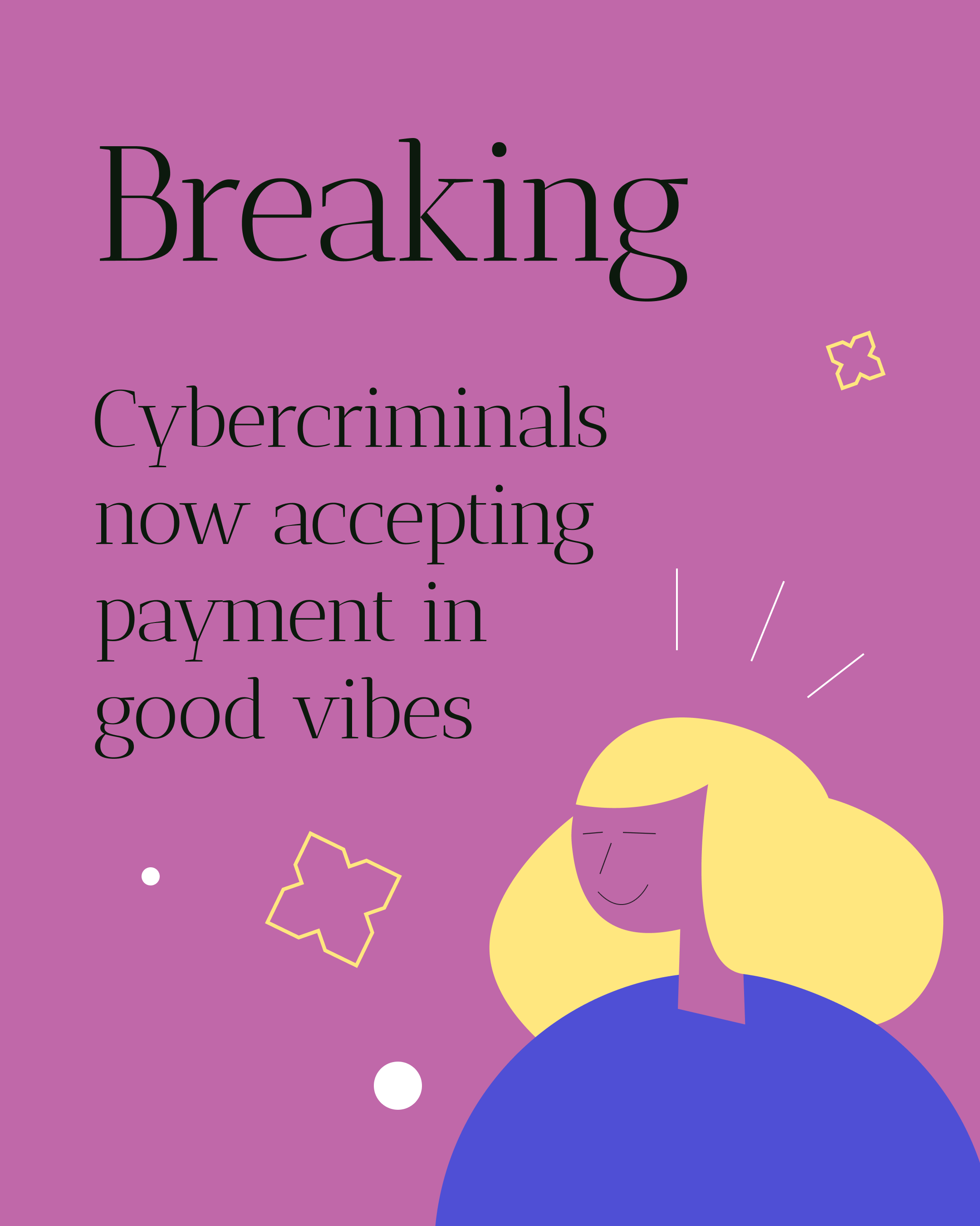


For Bennu I animated vector-based slides to help the team present to stakeholders in a clearer, more engaging way.
The goal was to keep the design simple and clean, but add just enough motion to guide attention and make the information memorable.
I took static vectors, built smooth transitions, and created a flow that made the deck easy to follow and visually impactful.


Sovren Tech – web exploration
I explored a series of web directions for Sovren Tech, focusing on a balance of simplicity and future-facing energy.
The idea was to keep the layout clean and intuitive, but introduce bold typography, strong colour blocks and confident spacing so it still felt modern and techy.
I tested a few approaches, from minimal, white-led pages to darker, more futuristic options, always keeping usability first and making sure the brand looked sharp, professional and current.


